Coloring Bears: Risograph Style Decisions
I tried to keep it minimal, but color and composition had other plans. This week’s final assignment: postcard-ready hiking bears!

Continuing from yesterday, I worked on the coloring part of my My Imaginary Art School assignment today! Actually, I secretly started coloring last night because I just couldn’t stop thinking about it. This time, I decided to design it like a postcard you might find in an Asheville souvenir shop, and imagined it being printed as a Risograph print!
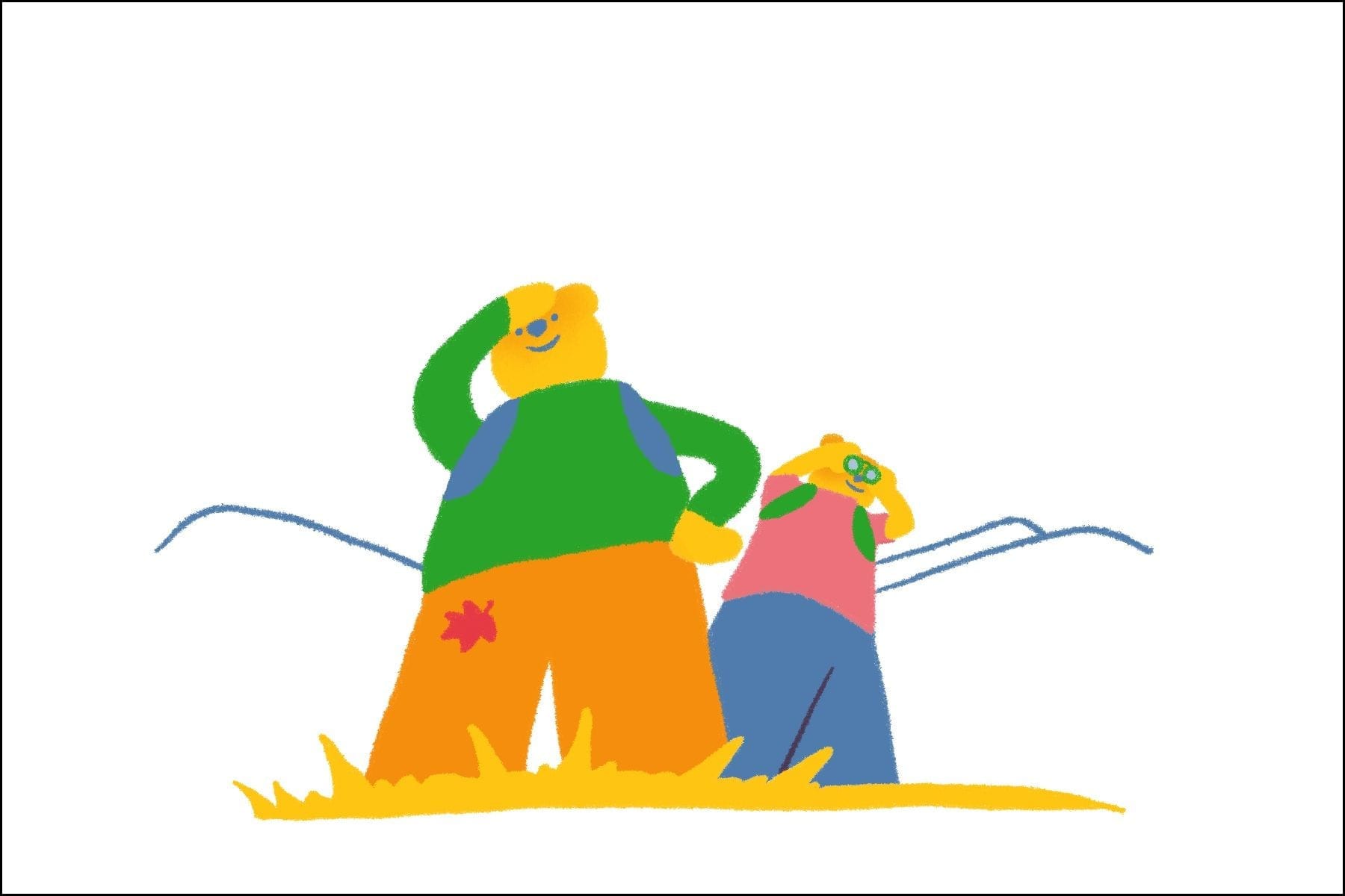
I started with four colors—red, yellow, kelly green, and cornflower blue. But the way I colored it ended up feeling more like an inkjet or silkscreen print. I realized I needed more gradients! That’s when I gave up for the night—I was out of energy.
This morning, I looked at it again with fresh eyes. While helping my husband with a Risograph print yesterday, I randomly thought: maybe teal would work better than kelly green to capture the feel of the Blue Ridge Mountains. I gave it a try… and it actually looked great! I added gradients in a few places too, and it started feeling much closer to finished. But then I hit a big dilemma: clouds or no clouds?
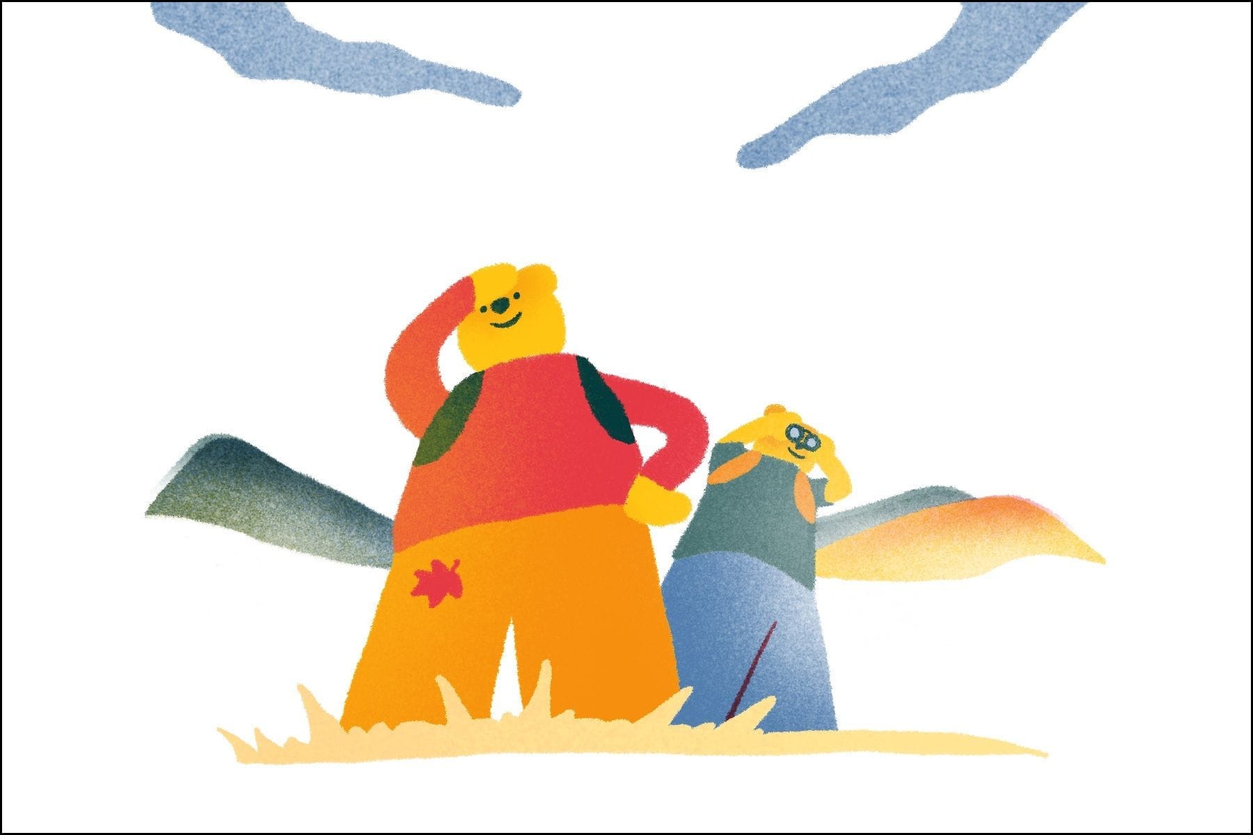
According to ChatGPT-sensei, both are valid. If I add clouds, the scene feels richer—it boosts the autumn hiking atmosphere and adds more depth and movement.
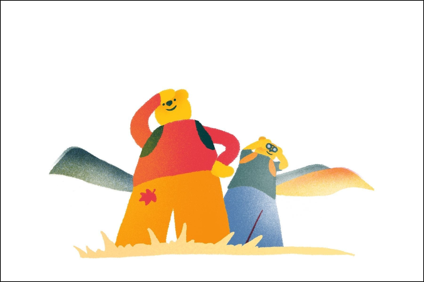
But without clouds, the bear characters stand out more, which could help them catch someone’s eye even from far across a shop. So in the end, I decided to treat both versions as “finished” and call it good!
This whole week has been a great lesson in how to carefully select and arrange visual elements—even in minimal designs. I’m already excited to see what I’ll be learning next week!