
Heartbreaking but Helpful: Risograph Lessons
Printed my Halloween card and attempted the Christmas tree risograph… and learned the hard way what not to do. Ouch, but okay!

Today was print day! I went to Spudnik Press with my husband (who’s prepping for next week’s Chicago Publishers Fair) for a little risograph printing session date.
I had two things I wanted to print:
- The back side of the Halloween cards I made during the last session
- The first illustration for Osusowake Club
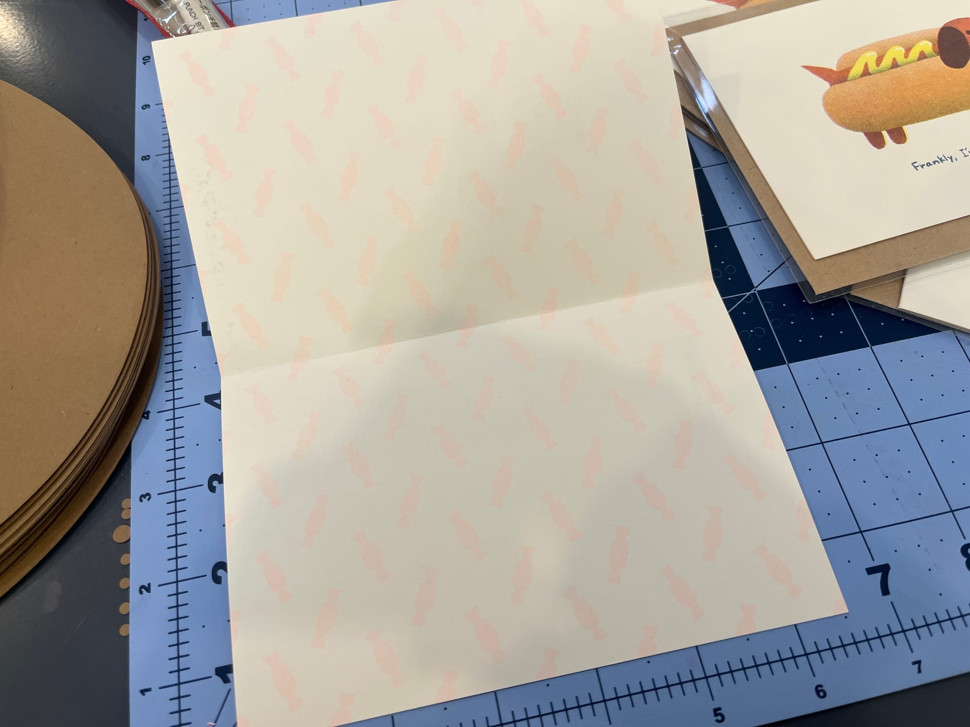
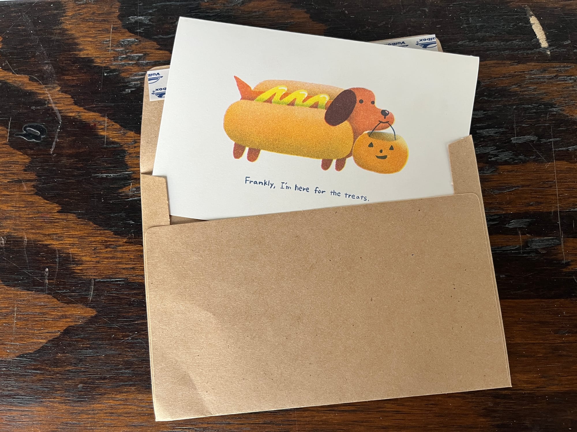
🎃 First up: Halloween card back!
I thought it’d be a cute surprise if the back of the card had a little candy pattern on it—so I went for it.
At first, I wasn’t sure how to set the opacity, so I tried 10%. But when I printed it… it was so faint I couldn’t even tell what it was. Whoops.
So I bumped it up to 30%, and this time it turned out really nice! I'm happy with it.
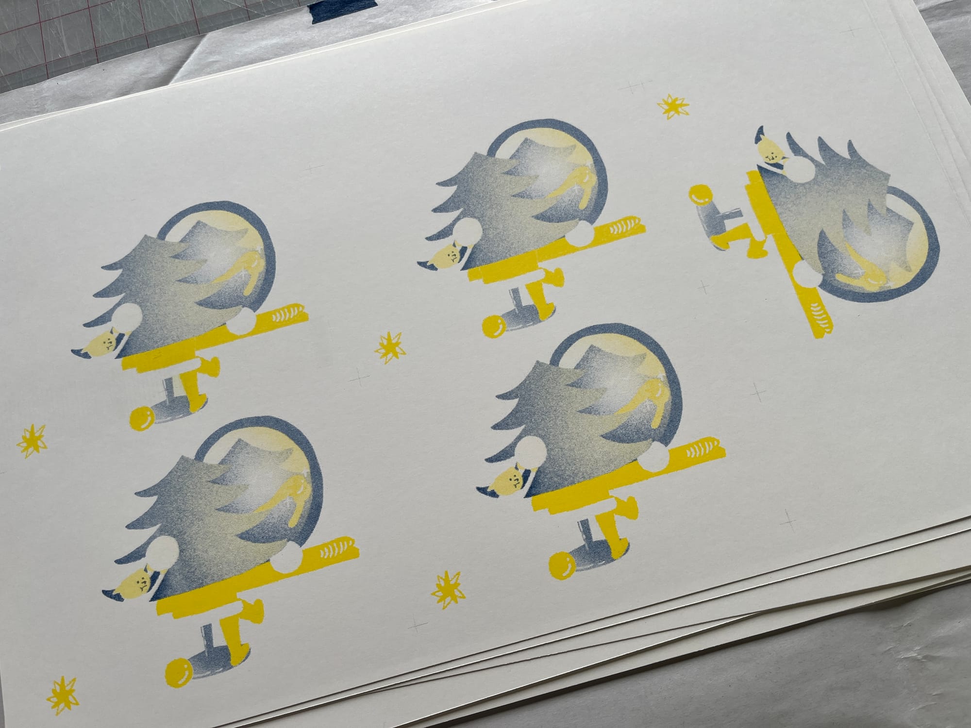
🎄 Next up: Osusowake Club's Christmas tree
...Or so I thought.
Before I started, my husband pointed out that using four inks and trying to knock out white areas might not work well. And sure enough—he was right. The face of the tree character is made up of three overlapping colors: teal, federal blue, and yellow. If those don’t align perfectly, the expression disappears!
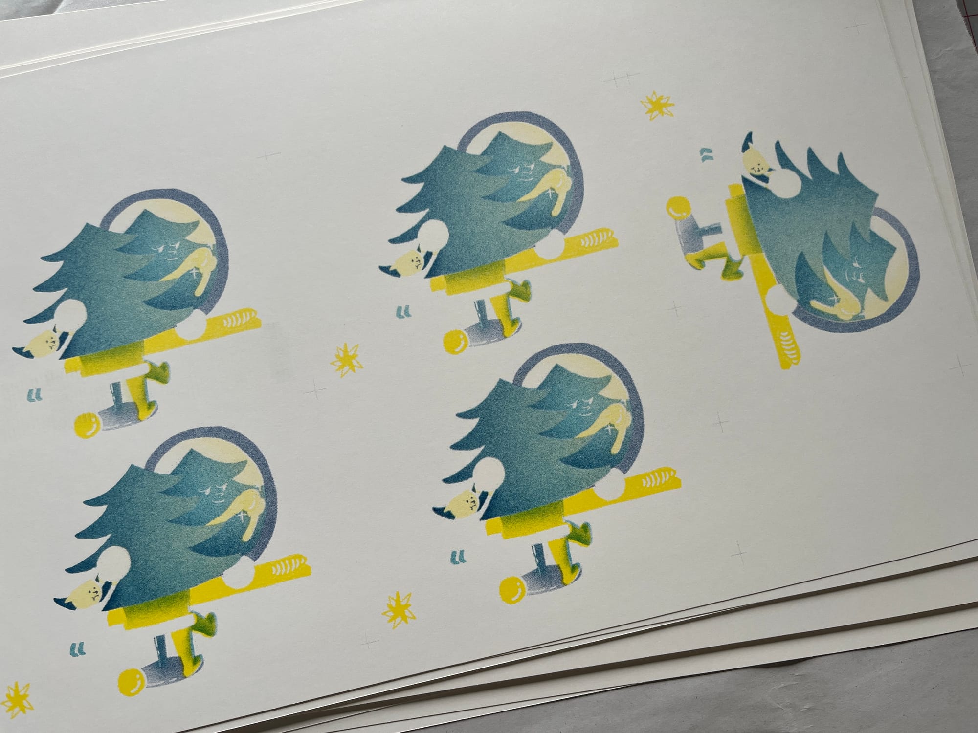
So we decided to lighten the federal blue around the face a bit.
After that, I layered the colors like this:
1st: Yellow / 2nd: Federal Blue / 3rd: Teal — and hey, the face showed up! That was a win.
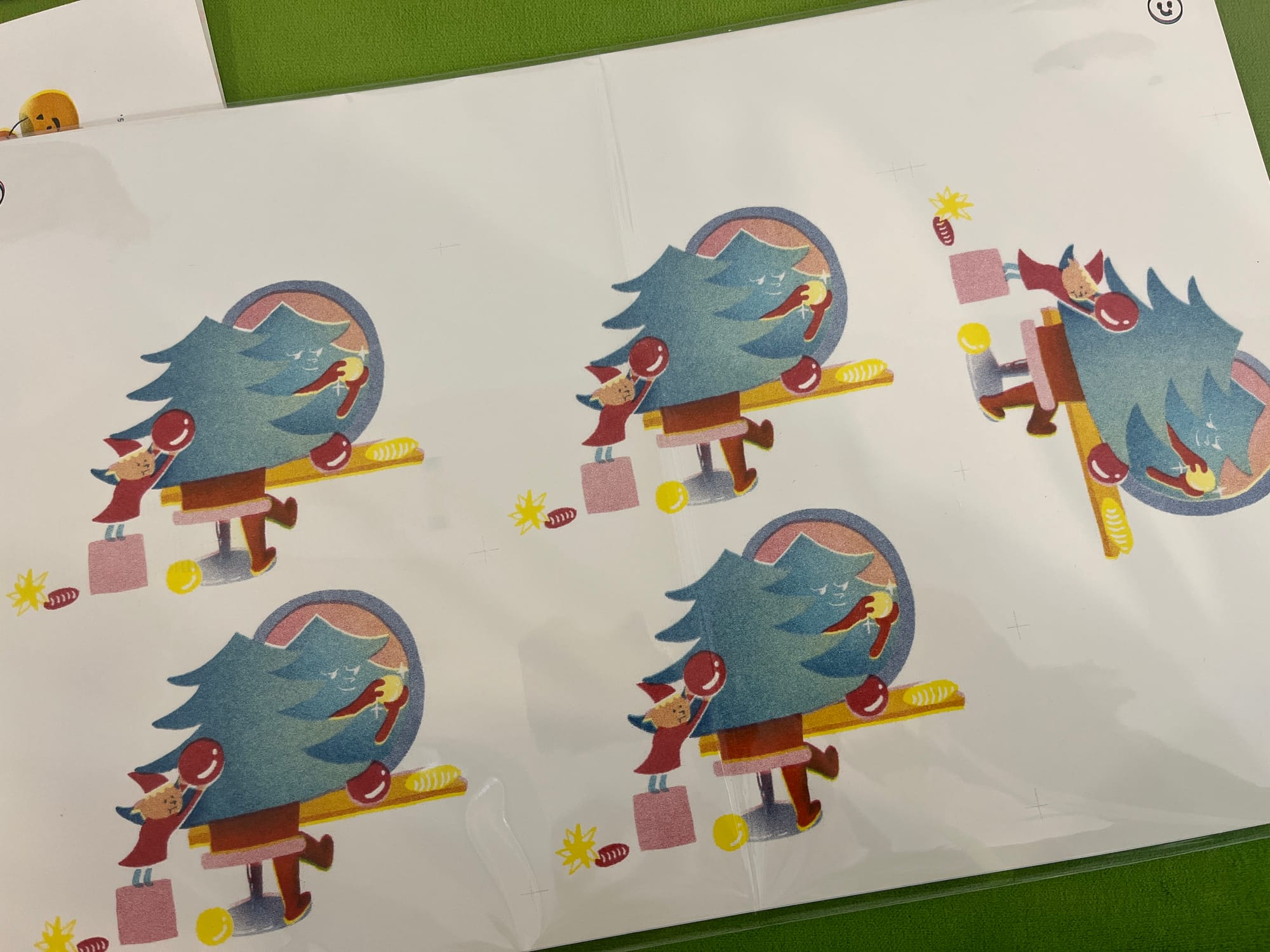

But… then I added the 4th color: Marine Red and… something was off.
It just didn’t feel right. It didn’t make my heart flutter. I didn’t want to send this to anyone.
Trying to put it into words:
- Marine Red is cute and very Christmassy on its own.
- But in this design, it made the elf stand out more than the tree.
- And due to my lack of risograph experience, I now know: thin lines (like elf and tree faces) don’t print well.
- The elf’s face needed to be bigger to read as “cute.”
And just like that… Heartbreaking.
I put so much work into this!!
✂️ Meanwhile, Halloween card = joy
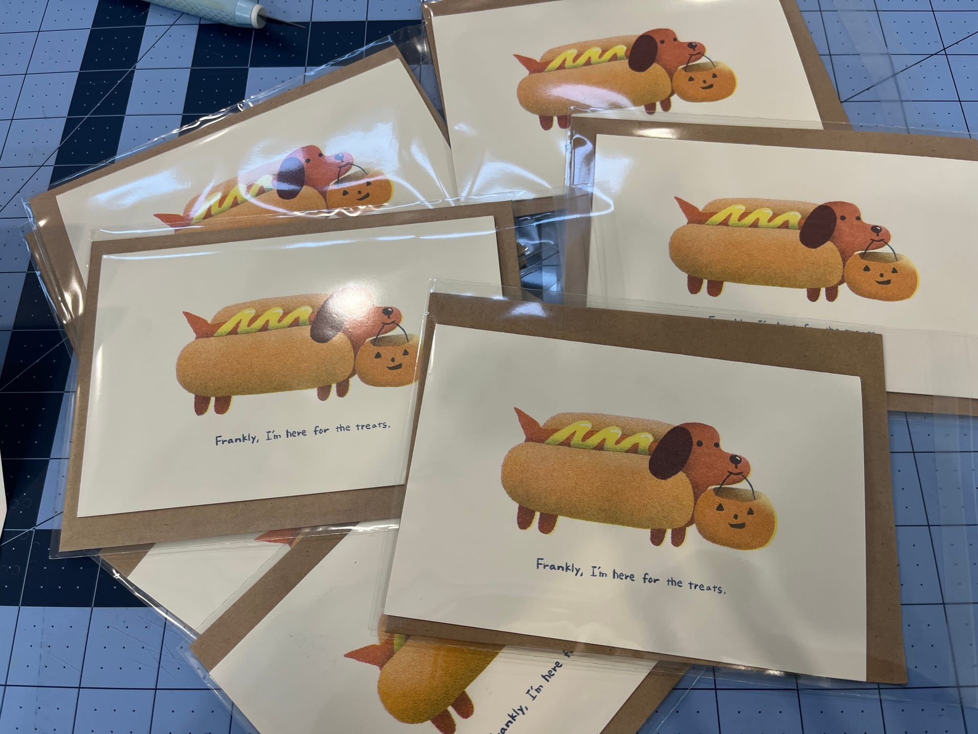
While waiting between color layers, I trimmed the Halloween cards—and they turned out so nice.
Looking at the Halloween card next to the tree illustration, I realized:
Risograph loves chunky shapes + layered gradients.
That’s where the magic is.
When drawing faces:
Avoid knockouts. Stick to one dark color.
So... the Osusowake Club illustration?
Starting over. All of it.
It was a rough moment. But I’m proud of the Halloween cards, and looking at them reminded me—I can make something good.
This is just one of those "deep breath and keep going" moments.