First Osusowake Club Design Complete
I added yellow light, simplified some shapes, and adjusted the colors—and now the tree makeover illustration is done!

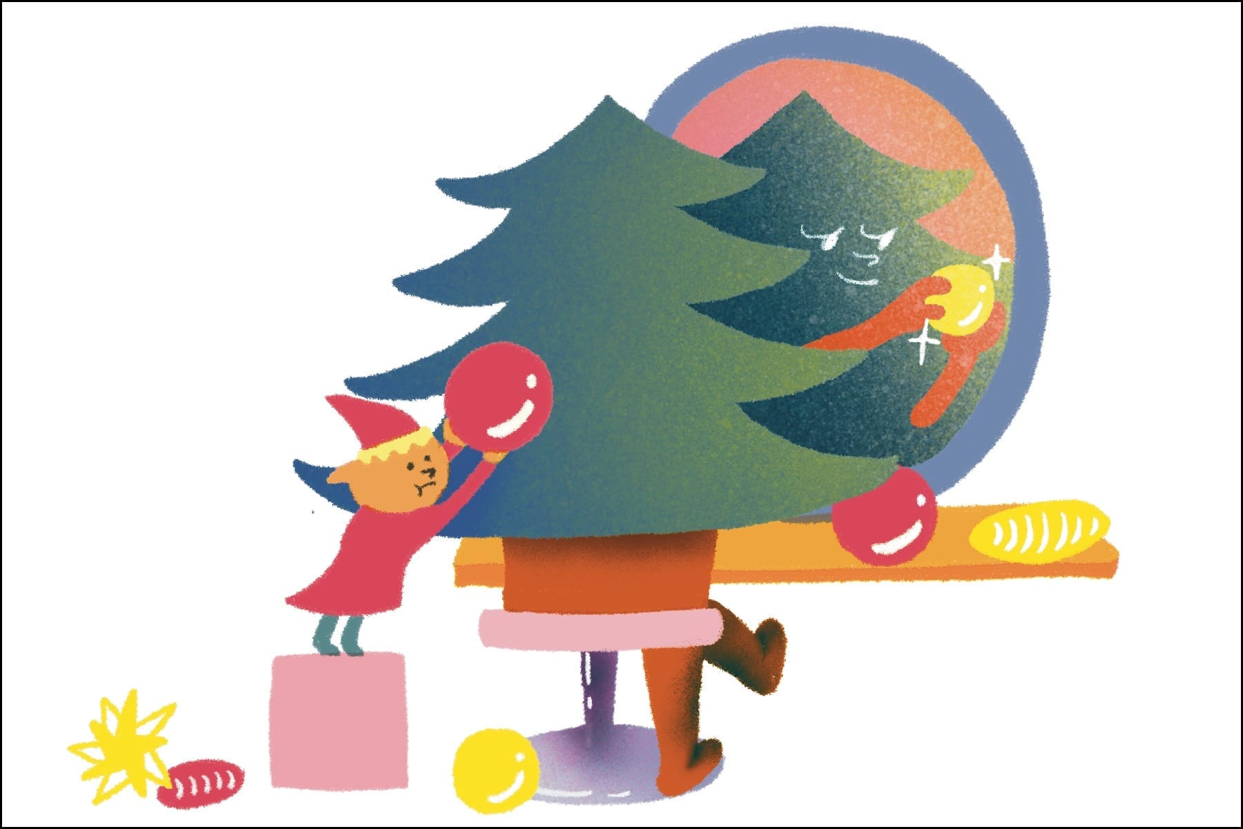
Today I kept working on the colors for the first Osusowake Club illustration—the Christmas tree getting a makeover.
Yesterday, the contrast between the back view of the Christmas tree and her reflection in the mirror wasn’t strong enough, so it felt a bit unclear.
But after adding a yellow light coming from the right side to both versions of the tree, it gave a nice contrast—and I think it added some sparkle too!
I also changed the elf’s step stool into a box, which added a more geometric shape and made the whole scene simpler. It also fits better with the Christmas ornaments around it.
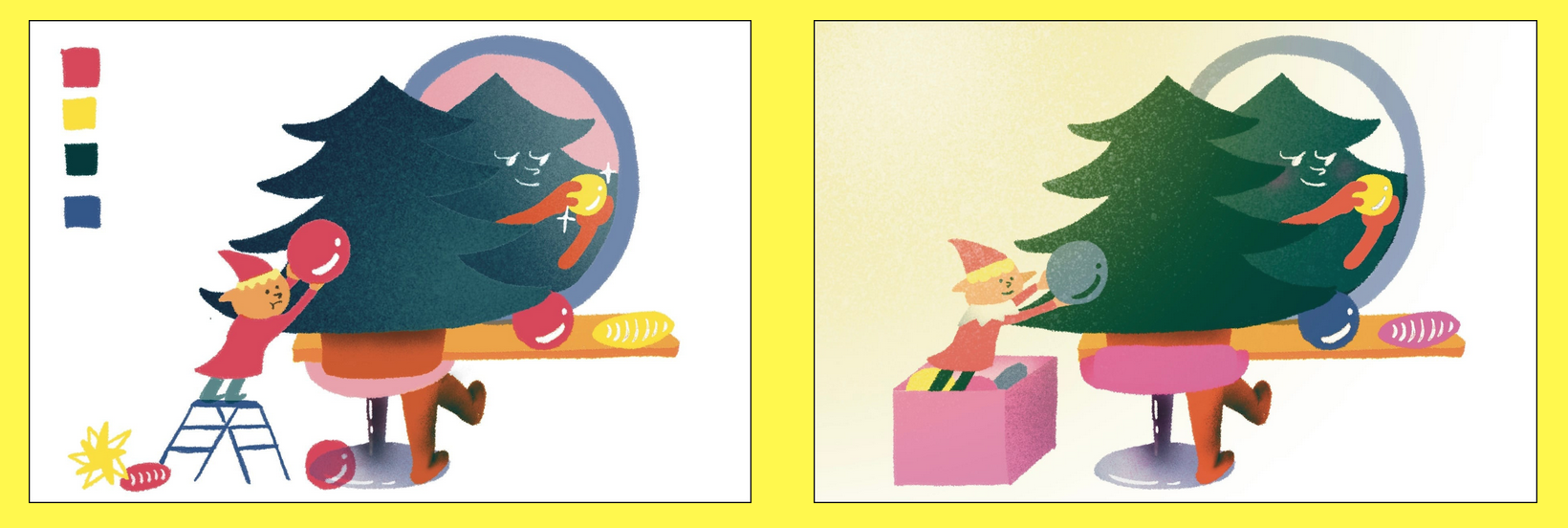
I removed the perspective from the tree’s chair too, which simplified it and made it easier for the viewer’s eyes to focus on the tree herself.
By adding a gradient to the tree’s color, I think it now shows how the light is coming into the room.
So this time, I decided to leave the background of the room uncolored—to keep it simple and let the tree’s gradient stand out more.
And with that… the first design for Osusowake Club is finished!
I’m planning to print it next Saturday at Spudnik Press—so hopefully everything goes smoothly then!