
Risograph Trials & Inky Triumphs
Printed at Spudnik today! Some tiny discoveries, a few head-scratches, and lots of inky joy. The Osusowake Club is coming to life!
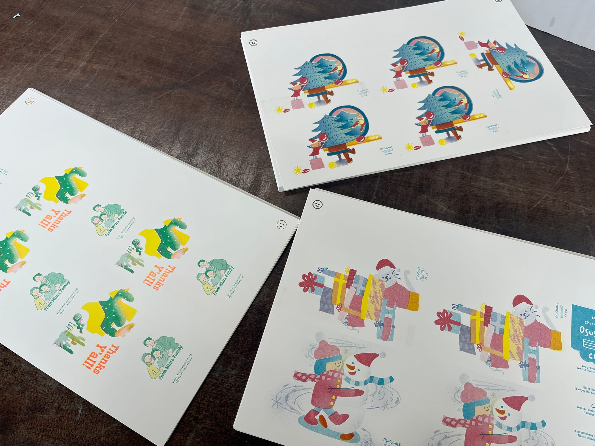
This morning, my huband and I headed over to Spudnik Press for another Risograph printing session!
I’m hoping to make a proper page soon to show off the finished pieces, but for now—let me jot down some notes for Future Me (and maybe any curious readers too). Basically… what I learned the hard way this time.
📝 Lessons from Today’s Print
- Stick to 3 ink layers max. You still get that lovely layered Riso look, but without overcomplicating things.
- Text should be one color only. Multi-color text gets muddy fast.
- Cut lines should be 100% opacity. No need to make them light—trust yourself!
- Don’t place low-opacity graphics in similar shades right next to knock-out whites with shadows—they cancel each other out.
- For double-sided prints with patterns on the back, make sure the pattern covers the whole surface and looks good no matter how it’s trimmed or flipped.
- Plan for trapping! A few-pixel shift is always going to happen, so prep your layers with slight misalignment in mind.
- When you’ve got a cluster of same-color shapes in tight spots, go for contrast over color accuracy. It’s better if things read clearly than if they’re technically "correct."
And finally… I’m still figuring out how ink behaves! Some areas that I wanted to pop came out pale, while others ended up too saturated and lost their blendy magic.
A wise friend once told me:
“You’ll be bad until you become good.”
I’m holding onto that. One day, I’ll get to say “I’m a Risograph Master!” with confidence.