
Paper Makes the Difference

Yesterday I wrote about Uma Kuji, but there’s actually one big way this project is different from my usual work: the paper.
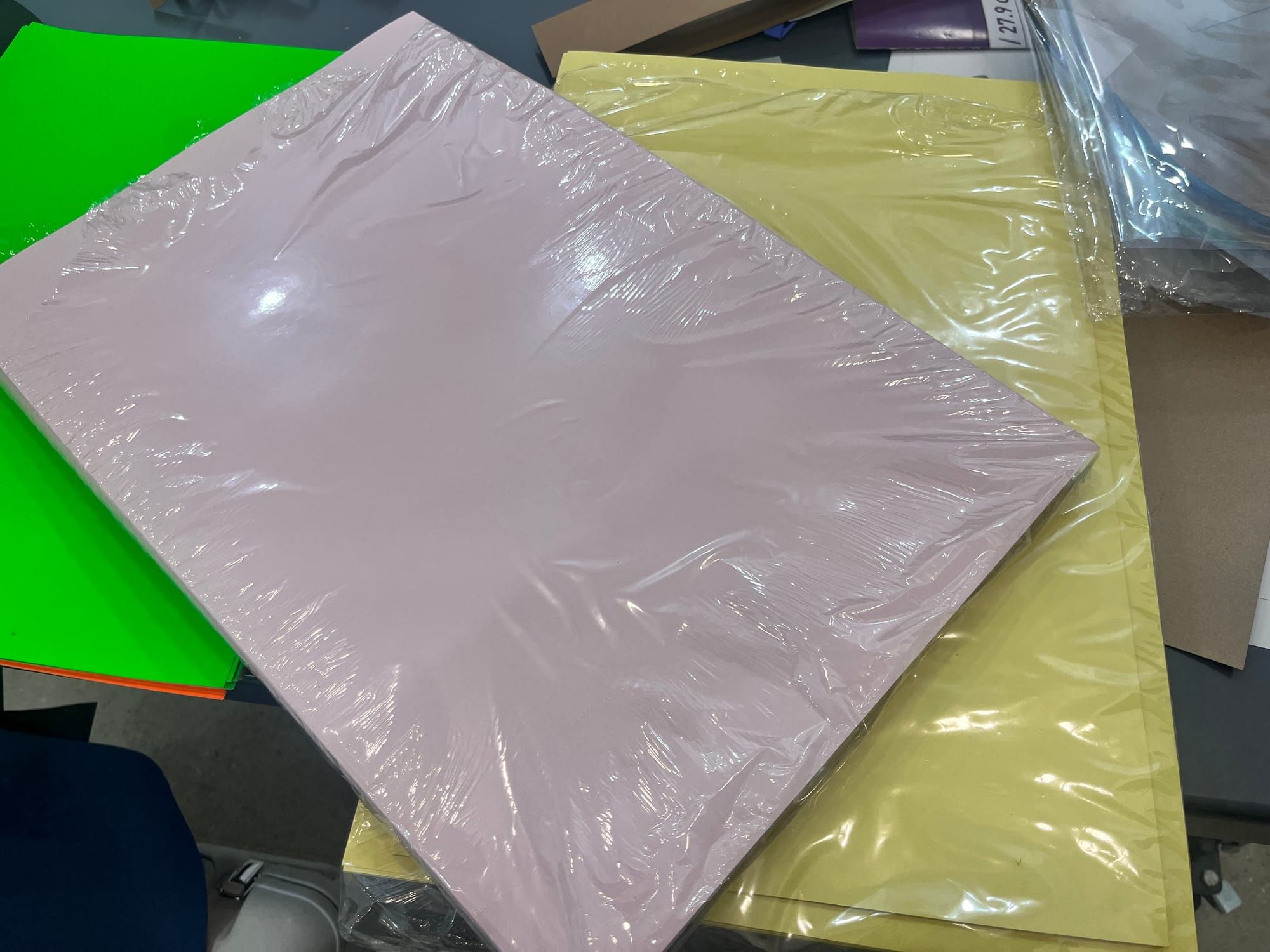
For production efficiency, I limited the risograph printing to just two ink colors. But using plain white paper didn’t excite me. So I decided to experiment—soft yellow for the cover and light pink for the text pages.
Originally, I was looking for a slightly pulpy, handmade-feeling paper. But finding that kind of texture in a soft pink shade here in the U.S. turned out to be surprisingly difficult! After searching around quite a bit, I finally settled on Pink Lemonade by French Paper. As for the yellow cover stock, my husband picked it out, saying, “Isn’t this cute?”—and he was right. It pairs unexpectedly well with the bubblegum pink risograph ink.
Paying attention to the paper choice made me feel like my production skills leveled up a little.