
Shark vs. Swimmer: A Picture This Exercise in Fear
This week, I stepped away from my usual illustration assignments to try a visual storytelling exercise from Picture This.

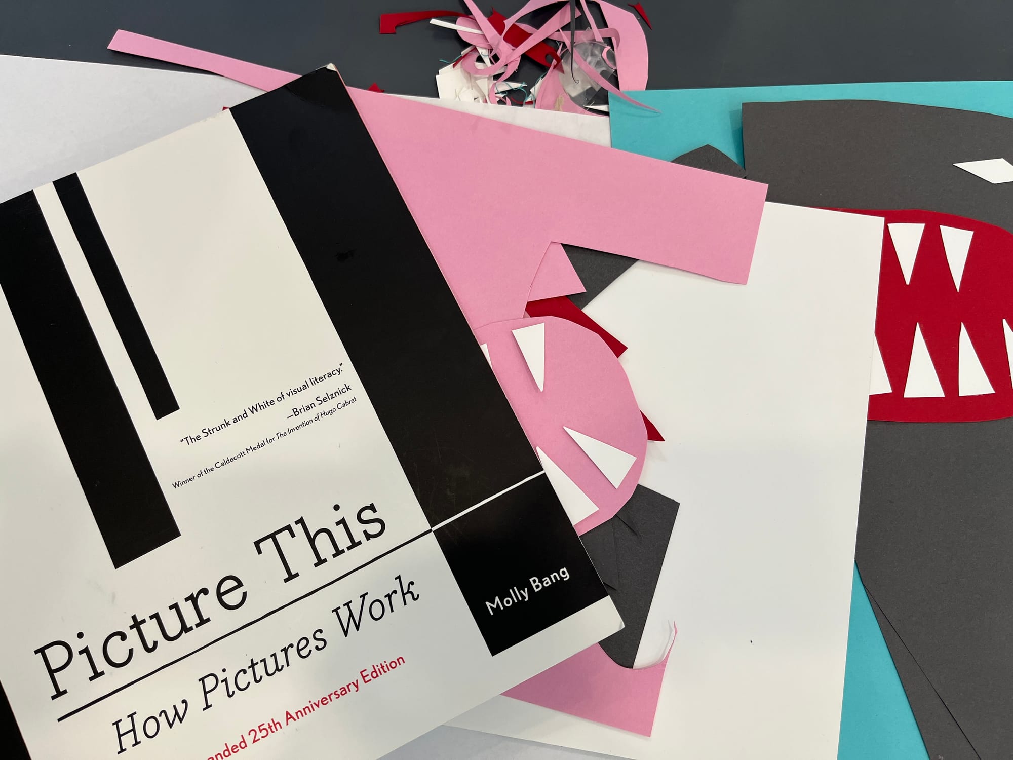
Since this is the week that bridges September and October, I didn’t feel like doing either the September or October assignments for My Imaginary Art School. So instead, I decided to try one of the exercises from Picture This, the book I introduced yesterday!
The prompt is called “Bird(s) or Shark(s) Attacking a Victim,” and the goal is to create an image that evokes fear, using only four colors of construction paper and scissors. While the book recommends doing it as a group activity so you can compare ideas, I was too excited to wait—so I tackled it solo!
Today, I chose to depict a single shark attacking a diver or swimmer. The challenge was to make it scary, not pretty—just like the book insists over and over.
The exercise starts with two questions:
- What is the essence of the person/creature/thing I want to represent? What specific elements in this situation evoke fear in me? How can I accentuate these?
- What principles might I use to evoke fear in a viewer?
I also added a third question of my own:
When is the scariest moment if I encounter a shark?
For question 1:
- Shark: Dorsal fin, jagged teeth, wide open mouth, and oddly pink gums (surprisingly human-like!).
- Human: Long, rectangular-ish body to suggest swimming. I thought pink would be a good color—flesh-tone to emphasize vulnerability.
For question 2:
- Placing the human at the top of the frame = a sense of floating, joy, freedom—blissfully unaware.
- Placing the shark below = heavier, grounded, in its element.
- Pointy shapes for teeth and mouth = aggression.
- Size contrast: Large shark, small human.
- Just a sliver of space between them = tension!
For question 3:
I imagined three moments:
- Seeing a shark fin in the distance
- Watching a shark gradually approach
- Or that split second right before it bites—and that one gave me chills. So that’s the moment I went with.
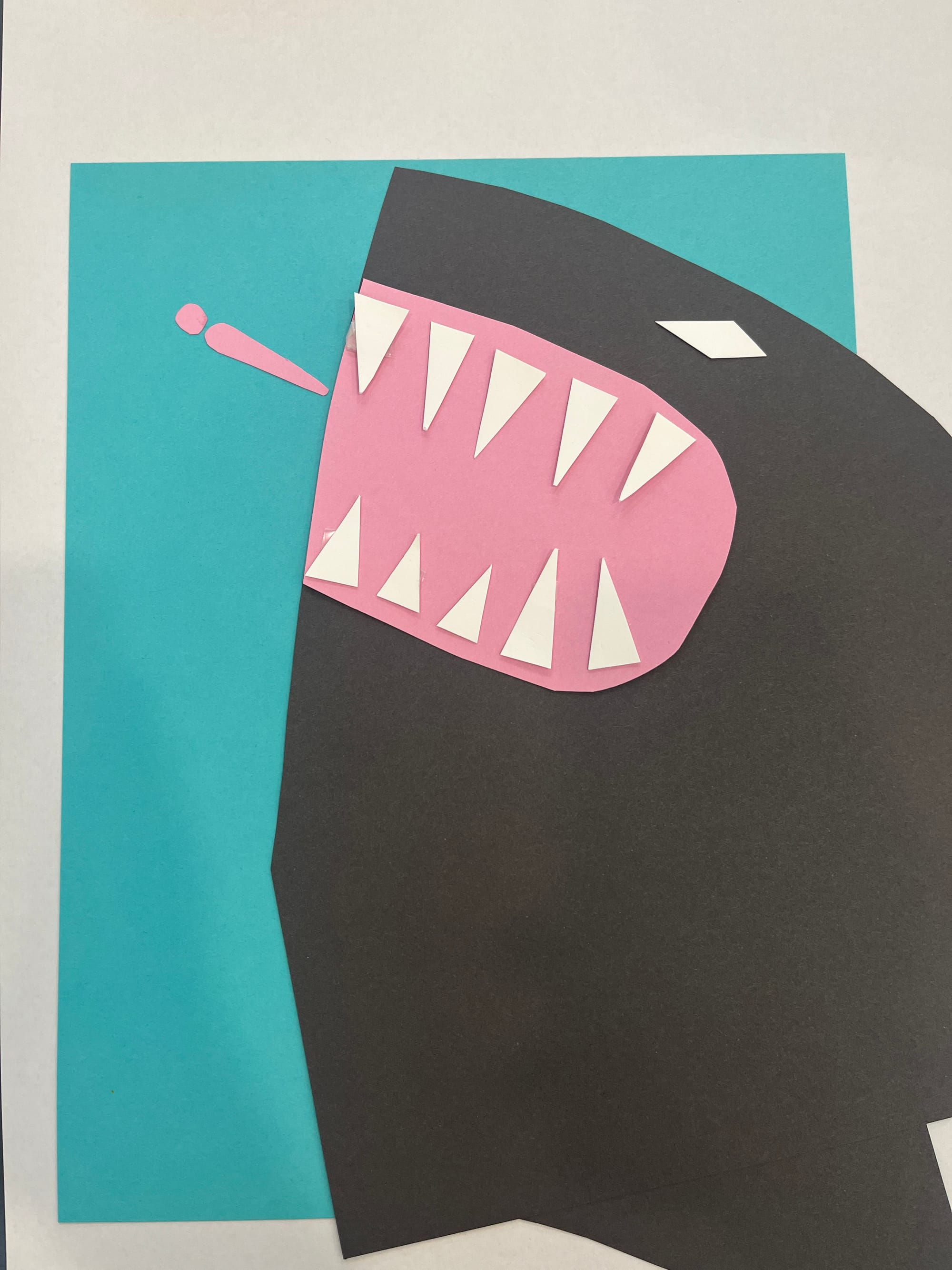
I chose four colors: white (required), pink, dark gray, and light blue. I started cutting and arranging shapes. My first version used pink for the shark’s gums, but it didn’t feel threatening enough. I switched to red, and it instantly felt more urgent and dramatic!
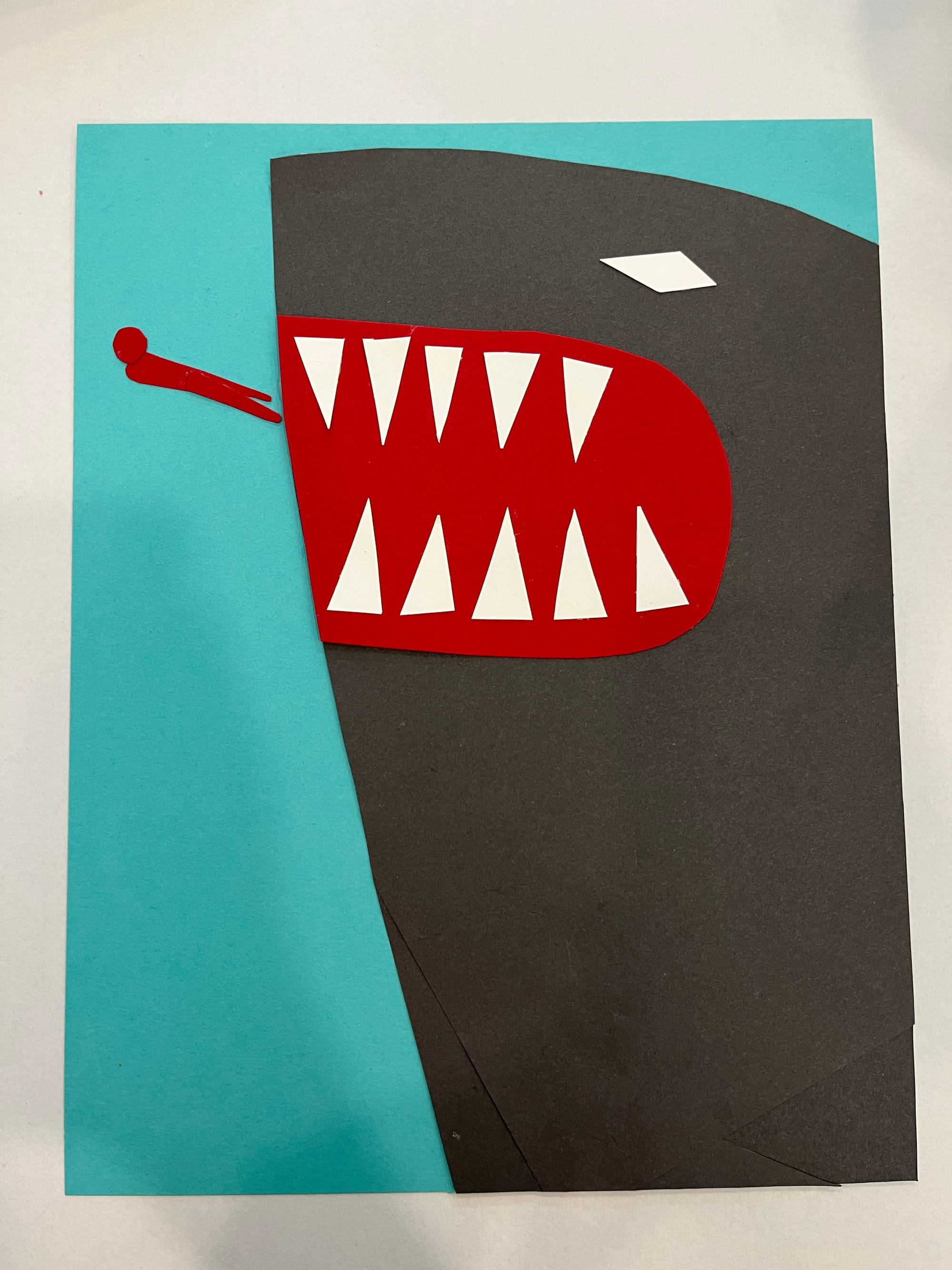
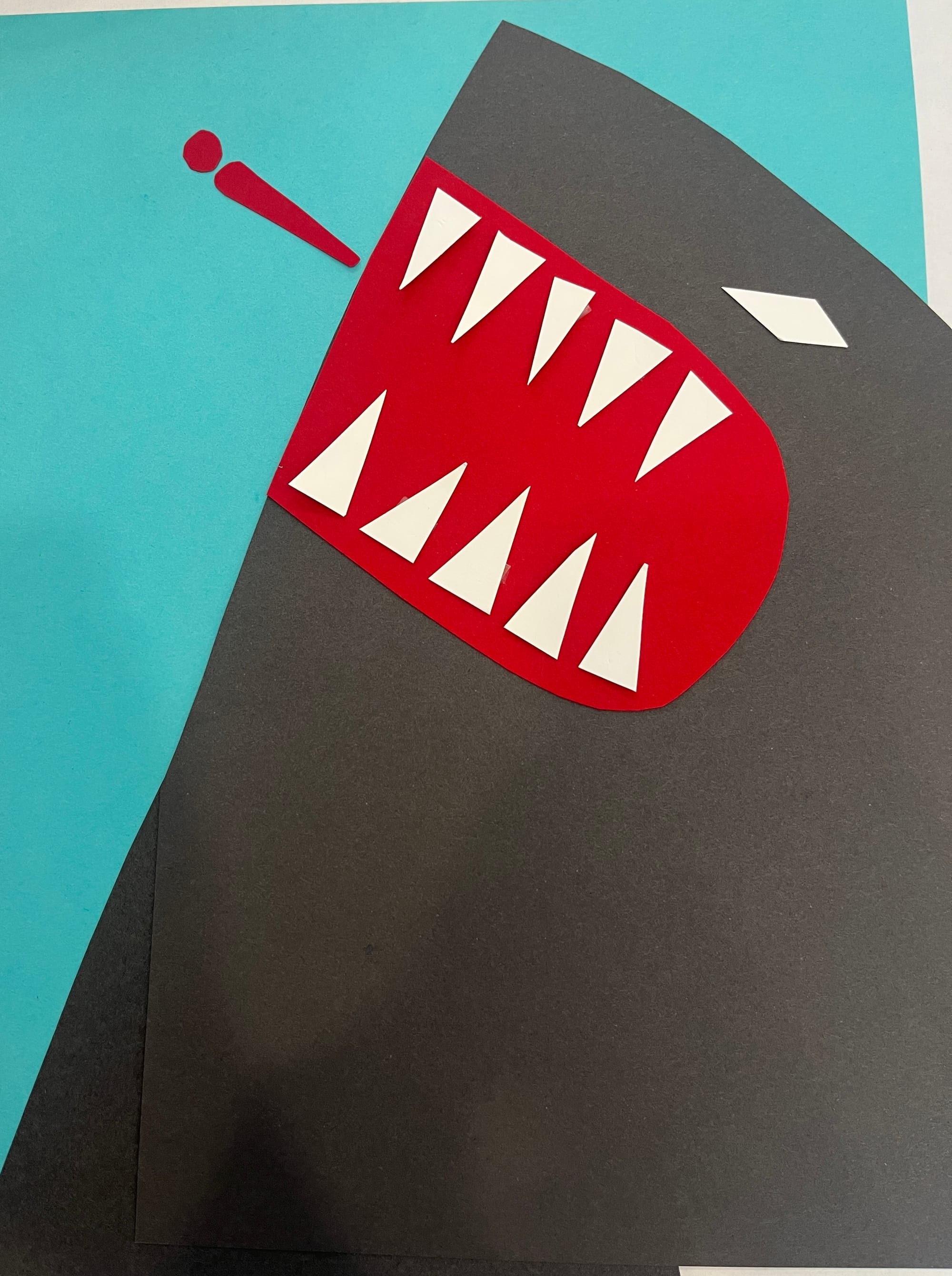
I’ve come to realize that if you want to create a sense of tension or movement, incorporating bold diagonal lines and shapes is key.
Funny enough, while reviewing photos of my work in progress for this blog post, I realized that one of my drafts felt more powerful than the final version. In that earlier draft, the shark’s body created a dramatic mountain shape that dominated the frame. It felt like the shark was really lunging upward with force—and that kind of energy felt scarier than the flat side-by-side composition I ended up with.
What I learned:
- Without a time limit, I’ll just keep shifting things around forever. I need to set a time cap, take breaks, maybe even go for a walk.
- Sleeping on a draft and getting feedback from someone else might help finalize the composition.
- But most importantly, I think I succeeded in my goal: Prioritize fear over beauty.
- By focusing on only the most essential shapes—the swimmer’s body, the shark’s head, gums, teeth, and piercing eye—I was able to keep things simple but dramatic.
It was so fun to think about what makes something “shark-like” and scary using just a few shapes. Tomorrow, I’m going to try the multiple sharks version of this exercise!