Risograph Experiments, Round 2! (Now with More Shadows)
Printed a bunch in two hours! Shadows, gradients, emergency teal ink, and a few coal-miner faces later—I learned a ton and had a blast.
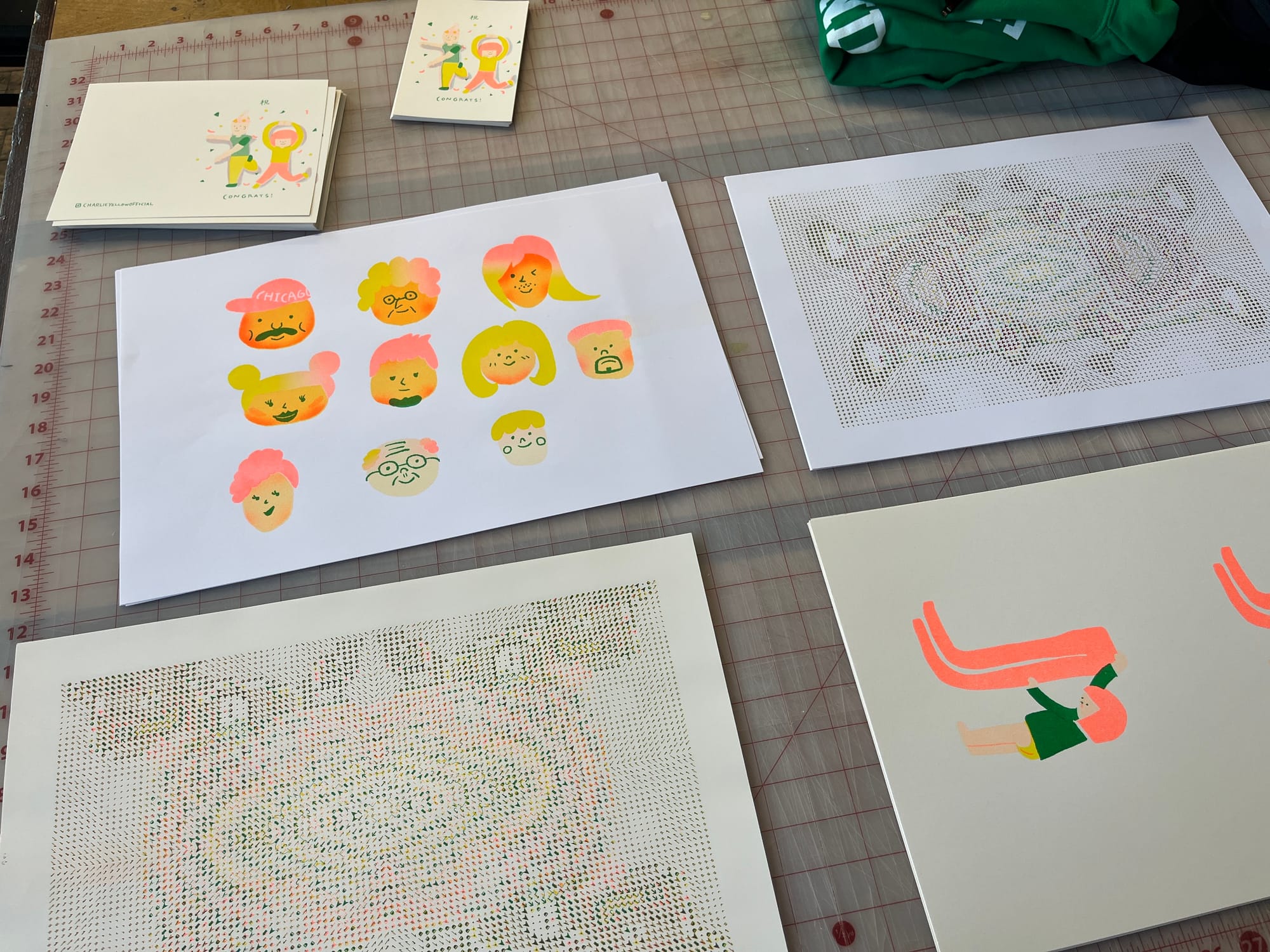
I went back to Spudnik Press the other day for my second round of risograph printing!
🧾 What I Did:
- Printed the celebration postcard
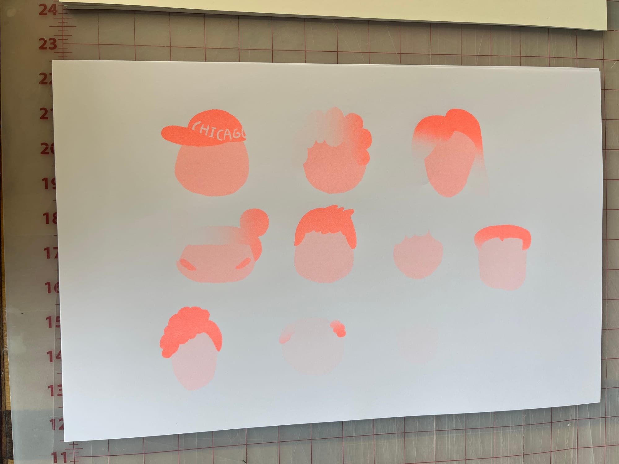
- Tried out some skin tone and gradient experiments
- Printed my long-pants illustration
Fluorescent orange? No complaints. Absolute perfection.
💡 What I Learned:
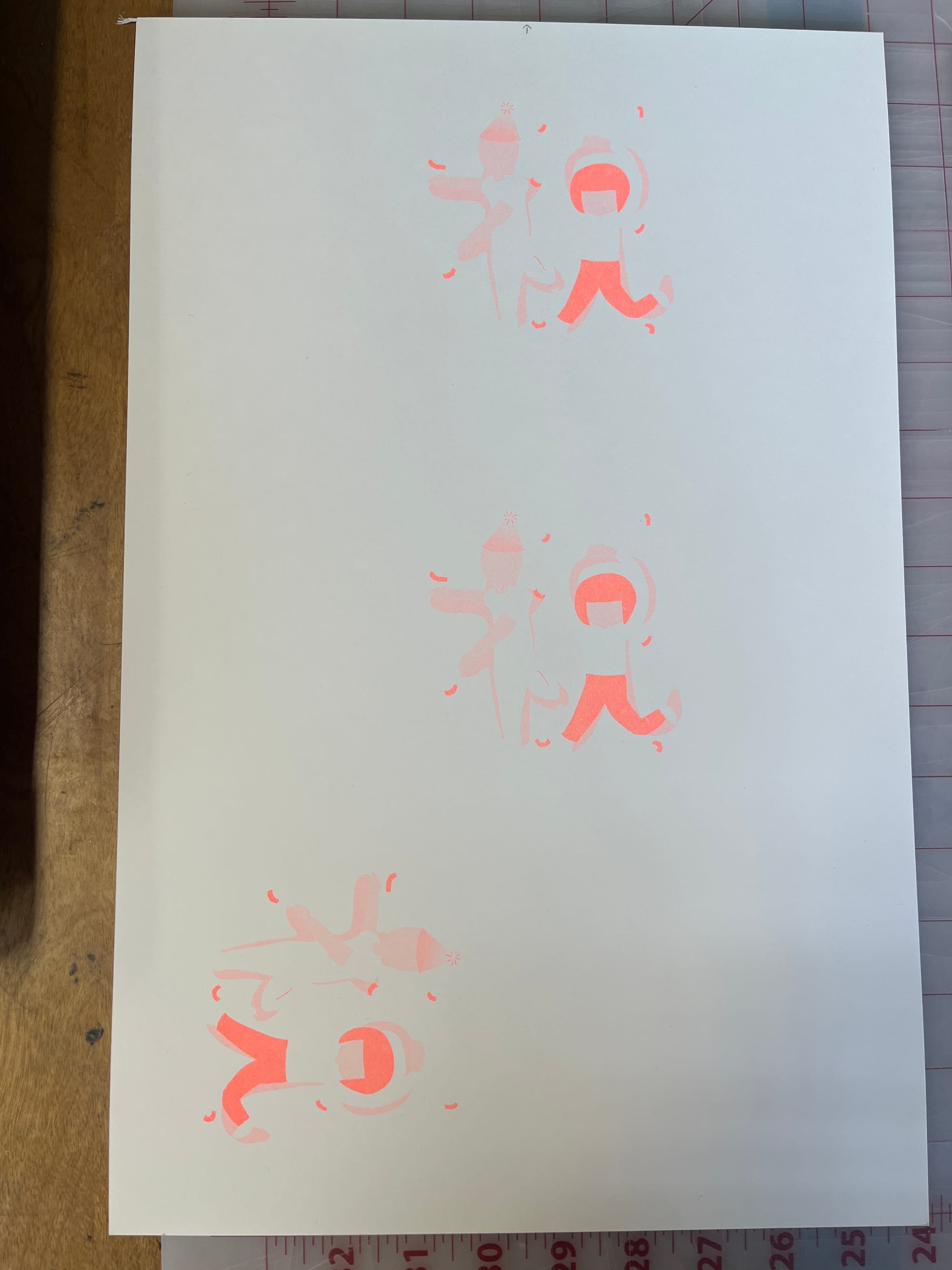
celebration postcard: The shadow on my celebration postcard ended up way too close in tone to the skin color… you could barely tell them apart!
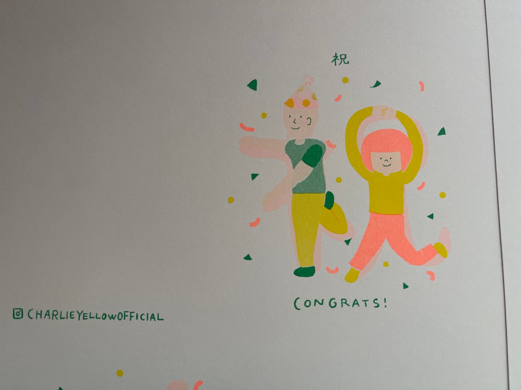
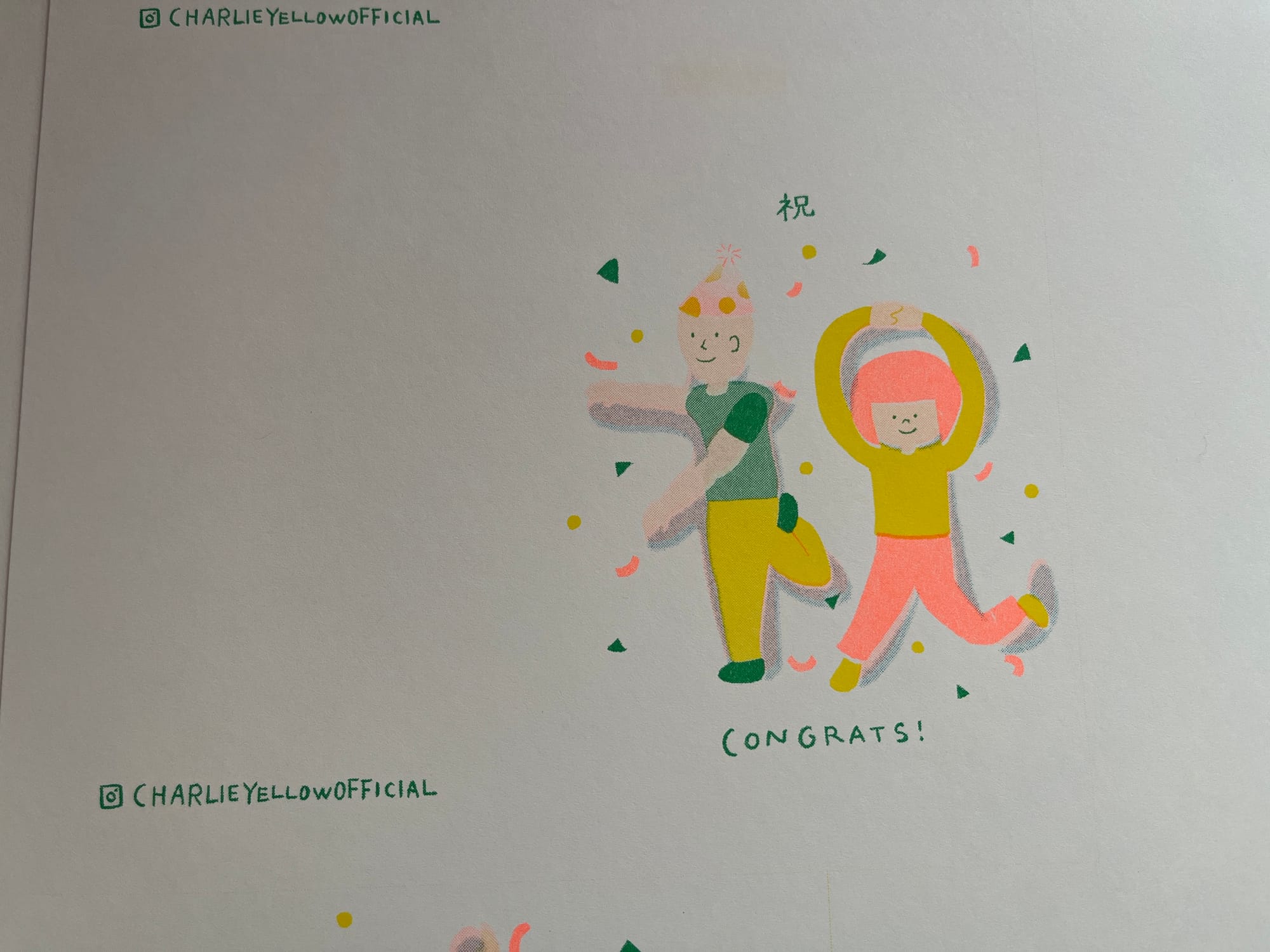
Adding the teal shadow gave it instant depth—totally changed the vibe!
So I whipped out Procreate, exported a new file with just the shadow area, and added an extra pass with teal ink. And bam—the character popped right off the page! Next time, I’ll definitely think more carefully about paper and ink contrast.
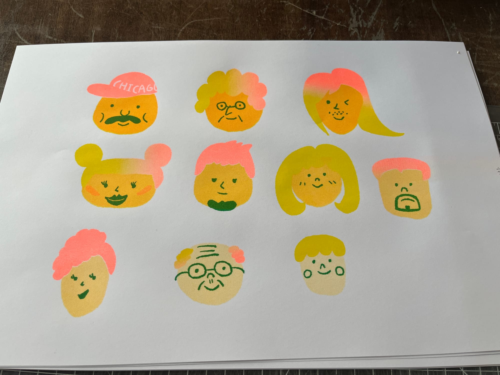
Skin tone experiments: The file prep was starting to get overwhelming, so I simplified the hair colors down to a two-color gradient. That made printing a lot smoother, so definitely the right call.
And since everything was going so smoothly, my husband suggested I try adding facial shading. So I threw together a last-minute shading layer and gave it a go!
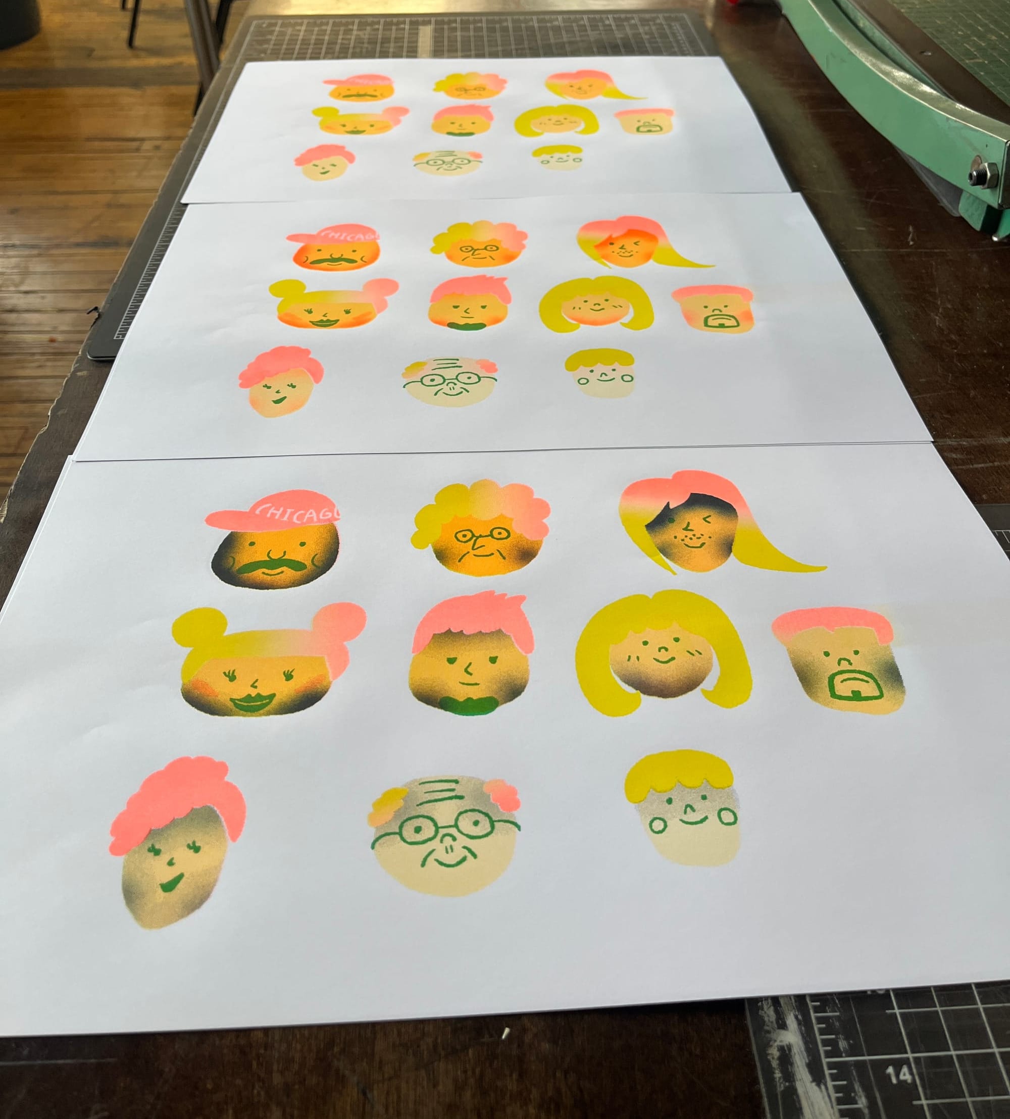
...But maybe I should’ve lowered the opacity more—some of the characters ended up looking sunburned… or like they just came back from working in a coal mine. Oops.
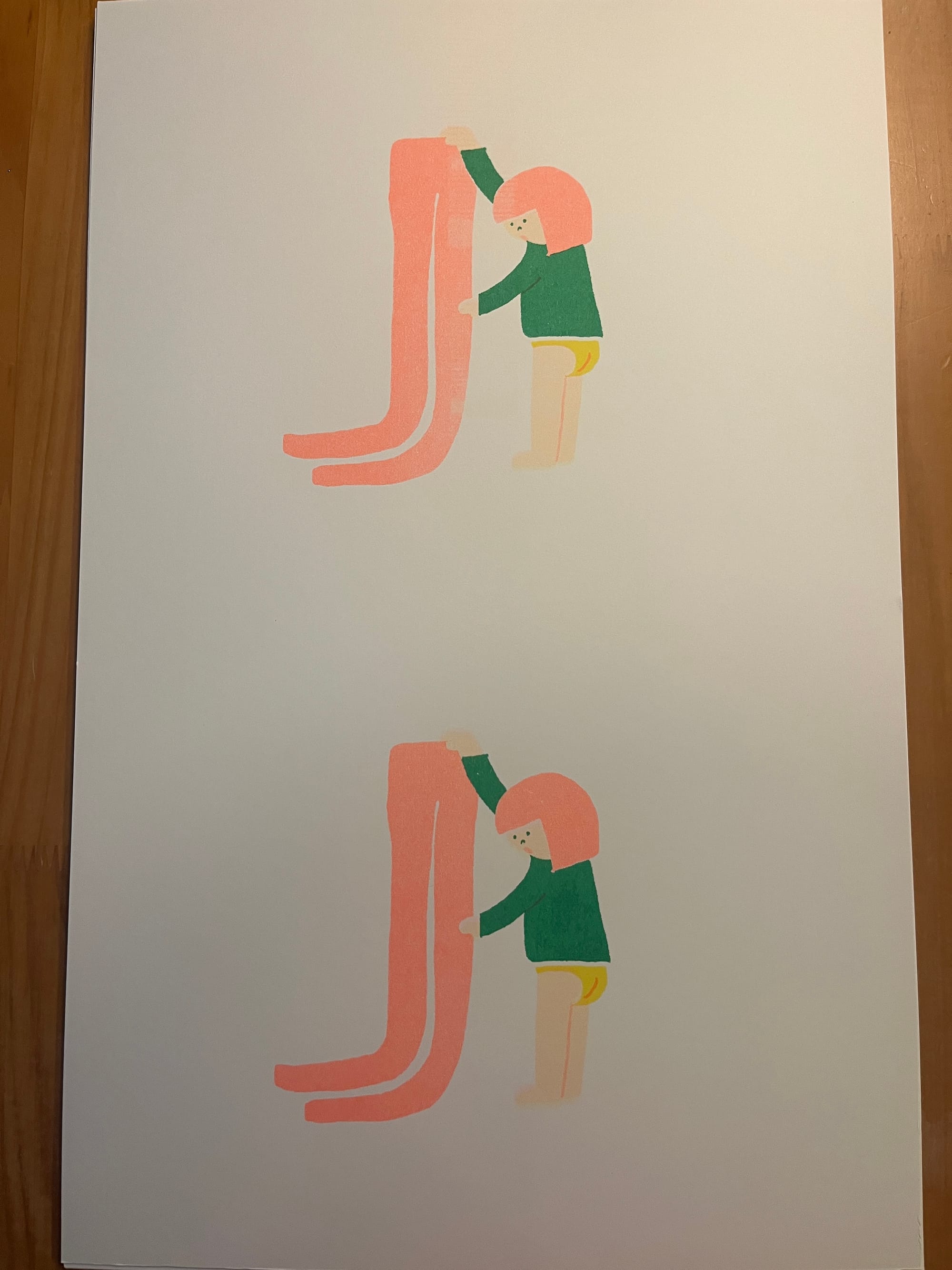
Long Pants Illustration:I think I did pretty good job!
I managed to get so many prints done in just two hours—totally satisfied! I also came away with some great takeaways for next time, so it was a super productive (and fun!) session.