
Studying Risograph Like a Nerd
After last week’s print flop, I grabbed all the risograph prints we own and took notes like a total nerd. Time to learn from the masters!

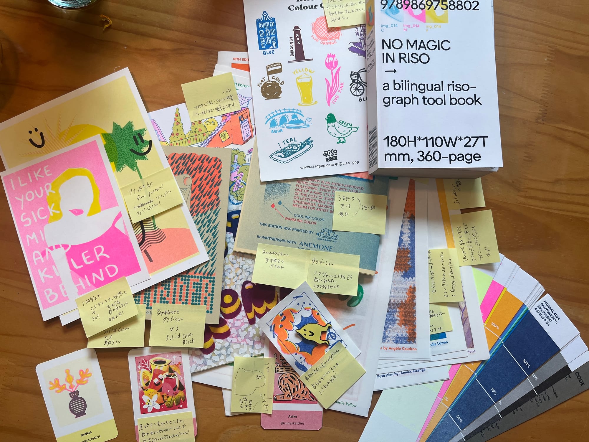
Today I gathered up all the risograph prints and art we’ve collected at home—pieces gifted to us, or prints my husband and I have bought—and I spent the day studying.
Why?
Because of last weekend’s print disaster: my illustration looked great digitally, but somehow lost all its charm once printed. I really don’t want to make that same mistake again, so I started looking closely at what actually works in other people’s riso masterpieces.
What kind of pens did they use?
What style of drawing makes the most impact in print?
How do they use ink density and contrast effectively?
I took notes on all of it while thinking about how I can apply these ideas to my own style.
Turns out—I really do love chunky, blobby shapes, and I think that’s what I’m best at drawing too.
But I used to get stuck on how to create contrast with color.
Now I’m realizing… I can just use bold outlines! That’s allowed!
Also, I’d been kind of scared to use lower ink percentages.
But looking at other prints, I saw that even 30% can give you enough color, depending on the ink.
You can get really nice contrast even with just white vs. 30%, no need to go full 100% all the time.
And that means—if I use values between white and 100% within a single color, I can create contrast and variety without needing 4 or 5 inks.
So I started writing down these little “aha!” thoughts on post-it notes—what I like, what I want to try, what makes a piece feel good to me.
I’m going to keep them scattered around my desk for now, so I can grab them while I work.